NORTH FACE PHOTO MURAL

This is a wall graphic done for a local outdoor retailer in conjunction with North Face. The wall is approximately 30' tall by 80' wide as seen below. The photographs were provided by North Face.

ROSALYNN CARTER EVENT INVITE


This was an invite I designed for a special reception and book-signing event for Rosalynn Carter held at Schuler Books. The design reflects solid blue margin of Mrs. Carter's book Within Our Reach.


CAMP BOOKLET

I had the privilege to work on this booklet redesign for a special needs camp. Indian Trails Camp didn't have a logo so a visual theme needed to be created. A common element surrounding the camp is maple trees so a maple leaf was used with rich natural colors and sepia tones throughout to visually unify the 16-page booklet as a whole.


SURGICAL CENTER BROCHURE

This four page brochure was geared towards private practice surgeons looking for a state-of-the-art facility in which to use for surgery with competent medical staff. The brochure purpose is to show that switching to this facility would be a seamless transition for surgeons with all the variables being taken care of.


MODERN BETHLEHEM CHRISTMAS CARD


Above is the cover of a Christmas card I created to send out to friends and family. Its purpose was to remind people that the story of Christmas is relevant to our modern times by communicating that through a modern artifact. Its secondary purpose is to get people to think if Jesus were born today what that might look like. (interior below)

FILM COMPANY PROMO BOOKLET


This 28 page, one-color, booklet done for Gorilla Pictures to showcase their work. Each work was given a description and the book included a DVD with sample clips. Only low-resolution images were available so a screen of 65 lines per inch was used on the images to mask the visible pixels. With the black paper and silver metallic ink, a feeling of the silver screen was achieved while matching their company's identity.


SWEET JAPONIC STATIONERY

This stationery was created to compliment the of other pieces of the band Sweet Japonic. The female figure was chosen to mirror the band's subject matter in their songs. The other elements match the band's funk, punk, and blues style.

THEATRICAL WEDDING INVITATION

cover
main interior page
This is the cover for an invite with a theatrical theme. It was for a couple to whom I am related to the bride. The groom owns his own movie production company and we have become very good friends as well as business associates. They chose to get married in an old movie theater which lended itself to a perfect concept to work from. The cover was created using both Photoshop and Illustrator. The piece opens upwards revealing the main interior page. The main interior page's image was achieved by photographing the couple sitting on my couch and bringing in theater chairs from stock photography. I added a screen texture for the background and used a light drop-shadow to blur the text a bit to create a look of old movie credits. The map carries through the look of an early movie theater with it's various elements. The RSVP ticket was a tear-off mailable piece created in Illustrator. Already stamped, ready for mailing, this RSVP ticket/postcard helped achieve a +90% attendance.
map

RSVP/ticket

ALTERNATIVE CHRISTMAS CARD

This Christmas card cover was a reminder to the viewer of the many things that can impede and distract from the true meaning of Christmas.

A GIFTED WEDDING INVITATION

This invitation was created for friends who were having their wedding just after Christmas. The invite was delivered like a tasteful holiday gift, wrapped in white tissue paper and red ribbon. The visual theme follows this gift concept throughout. So the first page give the viewer the feeling of surprise and joy common when opening a holiday gift.


GOLF MARATHON COLLATERAL


This is a brochure and workbook for a golf fundraising event. The event was a golf marathon to raise money for orphanages in other countries. Each participant played 100 holes of golf and donations were based on pledged money for each hole.


The work book encouraged the participants as well as help them keep track of their donations. While the self-mailing brochure (below) helped them inform their friends and family what they were participating in.

BAND T-SHIRT DESIGNS


These are t-shirt designs done for the local band Sweet Japonic in support of the 2 o'clock sirens album. Above: t-shirts from 2006 and below a design from 2007

SALES BINDER COVER


A binder cover design for a wood products manufacturer's sales catalog.

TRADE-IN POSTCARD

This three color front and one color back postcard was used to promote a trade-in bike sale with the used bikes received going towards charity.
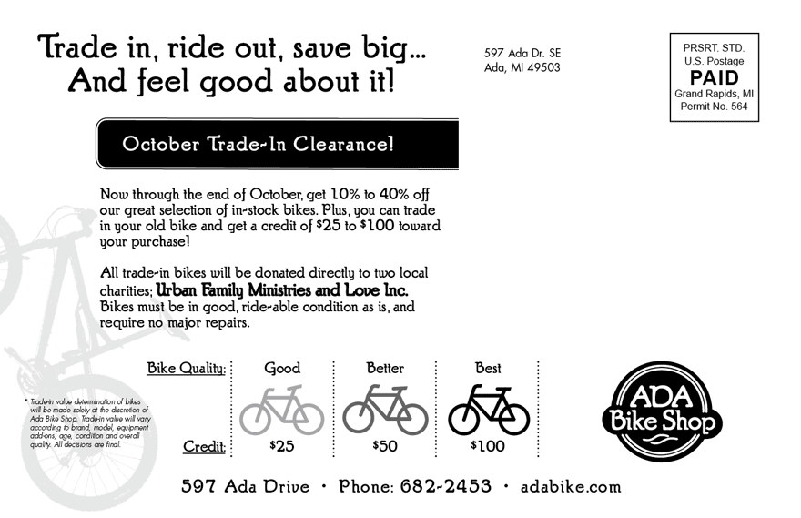